2019-nCoV: Spread In Chinese Provinces
Though my workplace is known mostly as a Tableau consultancy first and foremost, I actually don't spend that much time working with it, as my work tends to be about data engineering (sometimes in advance of someone else using it in Tableau!). This means that in the last year I'm a little out of practice, so I went back to my training (with the help of some timely reminders) to restart my practice; do something you're passionate about, and draw it out first.
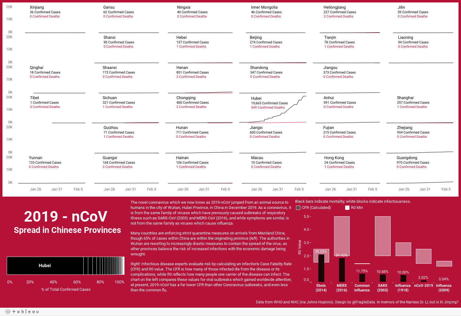
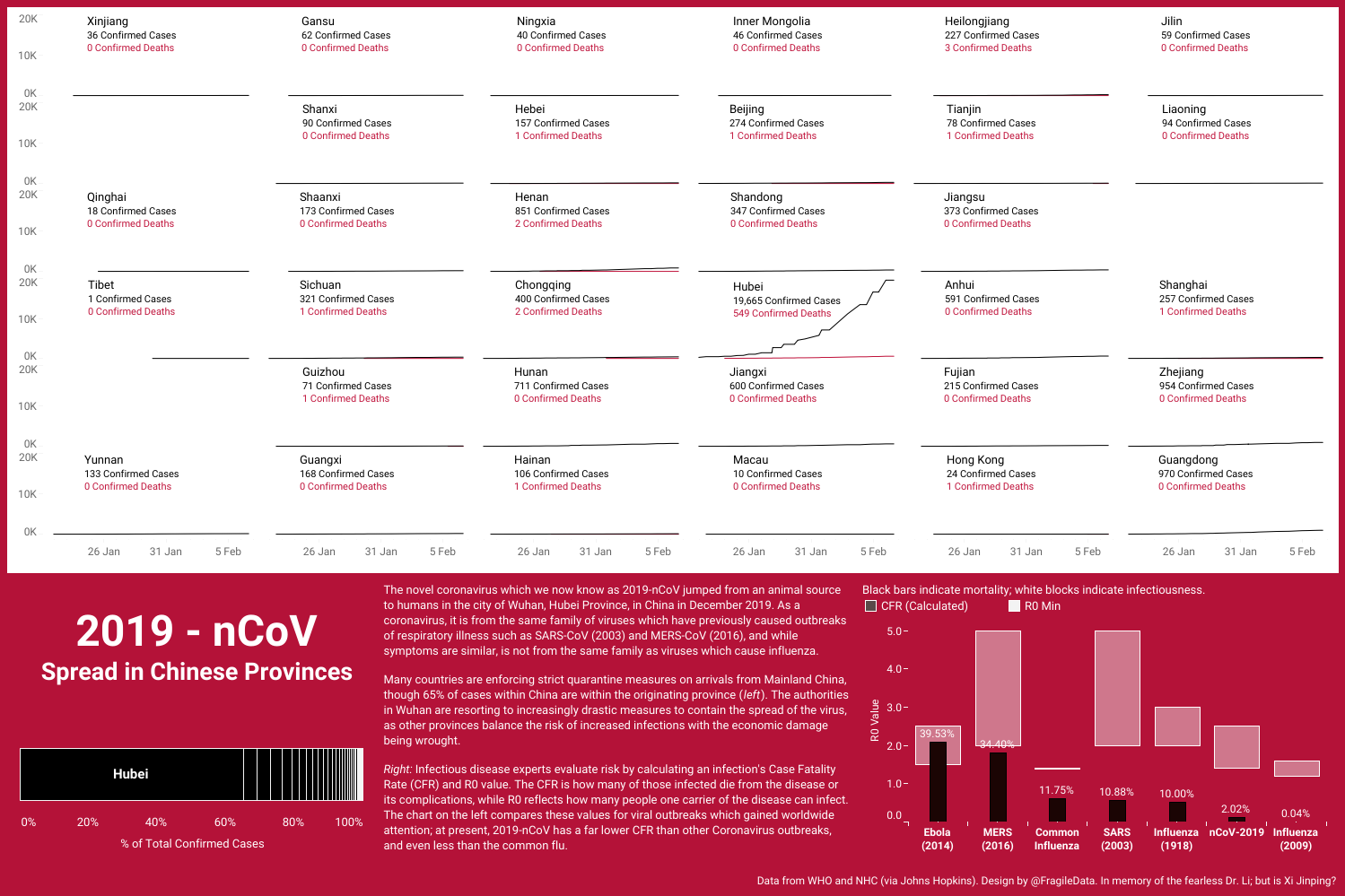
Over the past few weeks I have been chatting with friends in China, who are currently in various states of getting bored and back pain from working at home after the Chinese New Year holiday while the authorities try to contain 2019-nCoV. One, home for the holidays in Shaanxi Province, cancelled her flights back to Shanghai tomorrow due to the higher incidence of infection in Shanghai than Shaanxi, and even my Chinese friends in the UK are asking me if I have enough face masks. Johns Hopkins University is maintaining a virus watch dashboard on their GIS server, which is taking and translating data from the China's National Health Committee. They publish a sheet of this data, linked to on the dashboard, which I decided to use to visualise the spread of the infection over time. So, this is where my thoughts coalesced, after I had seen the data, but before I touched Tableau.
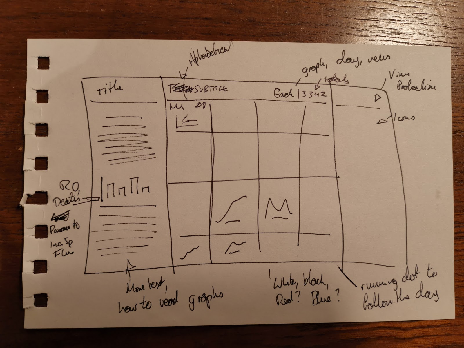
The main thing to build was the trellis chart/tile chart/whatever you want to call it, which I use Ryan Sleeper's summarised techniques here to do. After building it, I realised that this gives an OK idea of the spread over time, but is it really this confined? When I built the chart, as it was computed using the province name, they are rendered alphabetically. However, for something like this, where geography is important, I decided to go back and do it the hard way, assembling the provinces of China as their own grid, and then hard coding it. As one might expect, these provinces aren't actually laid out in a grid pattern, so I did the best I could to approximate it and put gaps in strategically (e.g. one on the upper right is the Bohai/Yellow Sea). Doing it manually did help me to understand Tableau's plotting better, and also The Information Lab alumni Jevon Da Costa's blog explaining the calculations.
My plan showed three clear panels; an explanation on the left with some smaller charts, the trellis in the middle, and another panel on the side which I had intended to do a graphic of advice from the WHO about handling the virus. I had underestimated the number of provinces in China so this last panel was put on the maybe pile pretty quickly, as the trellis still needed to be readable. That left the panel on the right, which now started to look to me like a lot of the dashboards I see at work, so that had to be moved. Putting it at the bottom of the sheet, rather than the top of the sheet, was purely a wish to do something different.
The second design choice chart was the mixed bar graph, now on the lower left, which is an odd looking way of representing information - one being a range, and the other just being a value (in this case a percentage). I am a known barbell chart person for ranges, so I banned myself from that, and I still wanted to keep the information (fatality rates and infectiousness) together as they are, together, an important way of assessing viral risk. Although I'm still a bit unsure about this representation, I am happy to accept this for what it is.
Lastly, the colour. Red is a careful choice to use when visualising health related data, as although the red cross is pretty ubiquitous as a symbol of medicine, blue and green prevail often because they are anodyne, "non biological" (as it were) colours. I chose red partly because it is a significant colour in China and partly because our world reaction to the virus has actually been far from anodyne, but instead extremely emotive. The late life and death of Dr Li Wenliang, an ophthalmologist in Wuhan who first noticed that a novel respiratory virus was circulating amongst incoming patients and got a visit from the police for his trouble, inspired passion but also ignited immense anger in China as a point to focus people's dissatisfaction with the way virus containment has been handled, which has involved supply chain thefts of medical supplies, suppression of criticism on social media, and increasingly coercive attempts to contain the virus.
Update: forgot to actually add the link to the interactive version on Tableau Public (click there if the embedding goes a bit funny on you), where you can hover over the lines and charts for more information.