Stream Graphs: The Good, the Bad and the Hard
As part of my foray into technically accomplished (though often questionably useful) graphs, one inevitable appearance is made by the Stream graph. Stream graphs first caught public attention with a now infamous viz by the New York Times about box office receipts, but their history is well chronicled by Andy Kirk here.
Stream graphs can be generated in a number of different ways according to the platform that you are using, some of which are more hacky than others. Tableau, for example, isn't a massive fan of curved lines (since they are not viz best practice) and does not intuitively lead the user towards creating them (e.g. with "Show Me"), while R can wrap around D3 library allowing you to build one in less than 10 lines of code. In this post I'll explore some different ways to make stream graphs, using data from Federal Emergency Management Bureau (FEMA) and the Southern Poverty Law Centre (SPLC). I'm using these two data sets because the shape of their data is different; the SPLC is fairly steady but has new categories impacting it about 1/3rd of the way through, while the FEMA data is more erratic and contains a distinct outlier event, which was the impact of the 2015 hurricane season.
Basic Tableau
Andy Kriebel wrote a blog post about how to do a proxy to stream graphs in Tableau 8 a few years ago, which still holds up. At its core a stream graph is essentially an area chart with added obscuring features, so using some data from FEMA here's one using a minimum amount of table calculations and/or scripting. Here I was following Emily Chen's tutorial, though I decided having dynamic parameters wasn't going to be useful here.
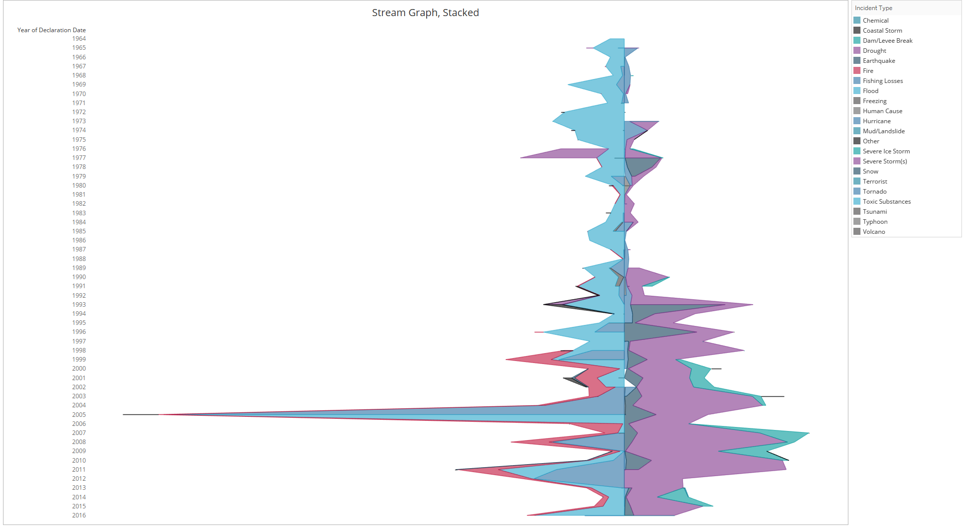
This is passable - it has spread the data over the axis in a way that makes it easy to see that FEMA are getting increasingly called into incidents, and most of those incidents are about natural conditions in some way (the large spike in 2005 relates to that year's hurricane season, as previously noted). However, it lacks the undulating curves which earn the stream graph its name, and the index function to spread the data isn't flawless, as you can see some holes in the chart around the early 00s.
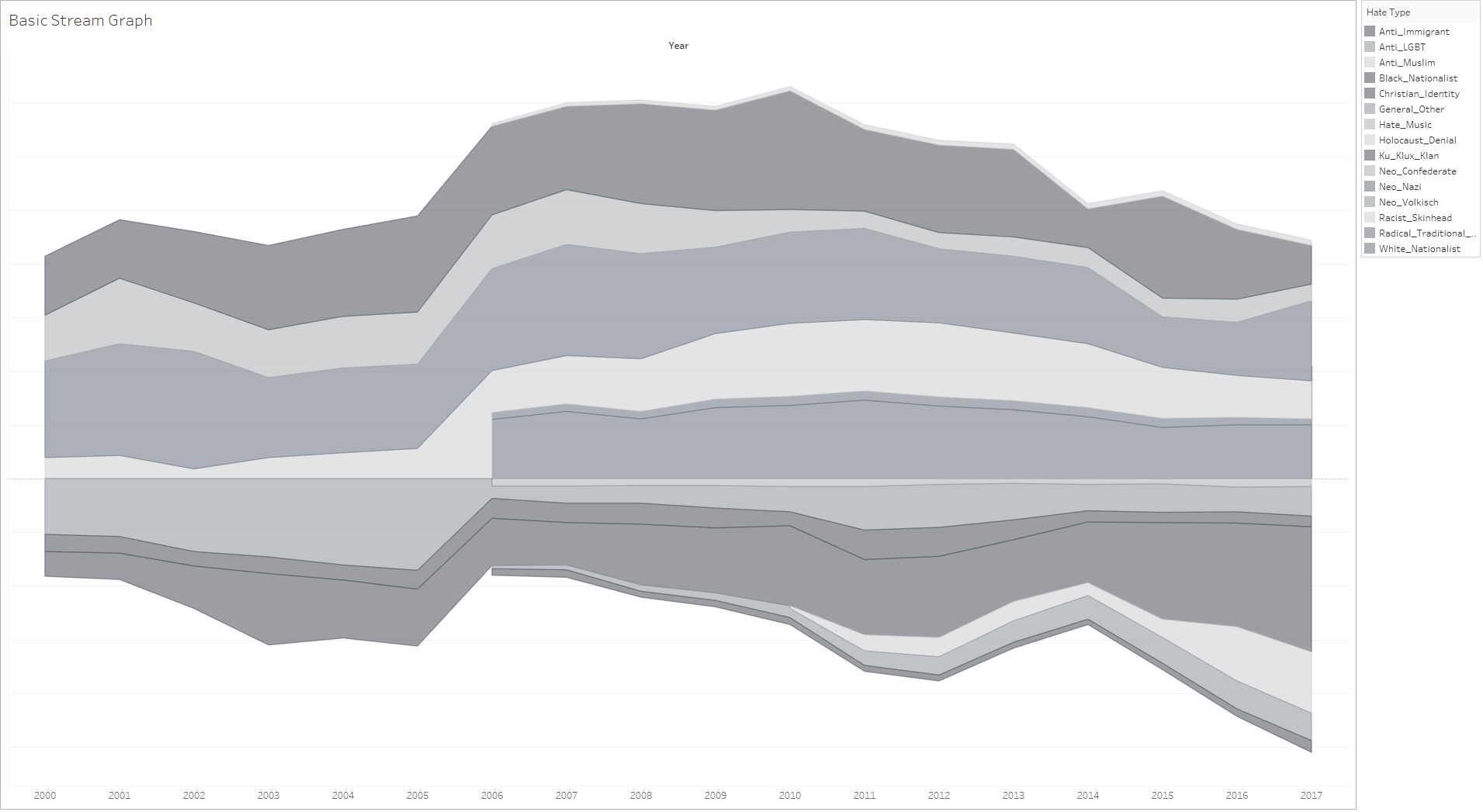
This graph with SPLC data is over a shorter time frame. This also effectively shows the count of hate groups over time in the US as attitudes change in society, and also clearly shows a disruption caused by change in the way the SPLC records groups in 2006. I'm undecided as to whether or not I like them vertical or horizontal, hence the difference in these two.
Best for: getting a proof of concept out of the door.
Tableau + Enhancements
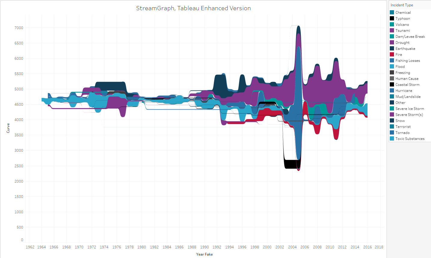
Following Alex Jones' popular stream graph entry for Makeover Monday in 2018, Ludovic Tavernier tried reverse engineering it on his blog (and wasn't the only attempt, as per below!). Ludovic's guide reminds me of the calculations for creating Sankey diagrams, and he drew inspiration for it from Rody Zakovich's area bump charts. This requires a little bit of data engineering outside Tableau in order to create a cross join for load of calculations that are required to generate it. Following his tutorial, here's my results for the same FEMA data. Not shown is a lot of googling trying to work out why it's turned out with spaces, if someone can point me in the right direction that would be great.
And now, the same SPLC data. These do have curved lines in and now start to look more recognisable as stream graphs, as well as cohering together better than the FEMA data.
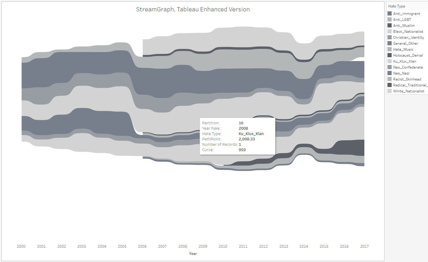
Here's where we come into the second major issue with these kinds of vizzes in Tableau, which is that nth degrees of calculations often leave you with information which cannot be easily parsed back into an original format, say, to understand how many neo nazi groups the SPLC recorded in 2014. This could be achieved with a dashboard action to one side but I like the intuitiveness of tooltips, and this way requires further work in calculations to get those points to respond to the right information. As you can see, I've decided to settle on horizontal.
Best for: something stylistically similar to famous infographics, but sticking within the tools you may have access to at work.
Base R
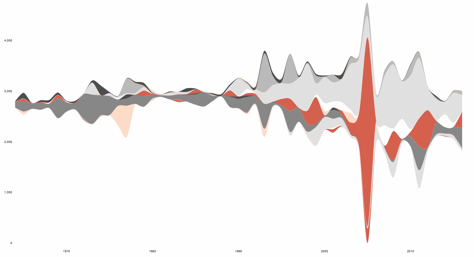
The Trump stream graph data points were generated in R, but using R is only valid for half the battle (as the rest was in Tableau). The algorithm/mechanics behind the stream graph have been published as academic papers, and this has subsequently led to functions to create the graphs being built using base R (i.e. no or very little extra package functions), such as this tutorial by Dorian Banutoiu which I followed. However, even if you are familiar with coding, brace yourself, and also tell the machine you're working on to brace itself if it's a laptop or a small PC.
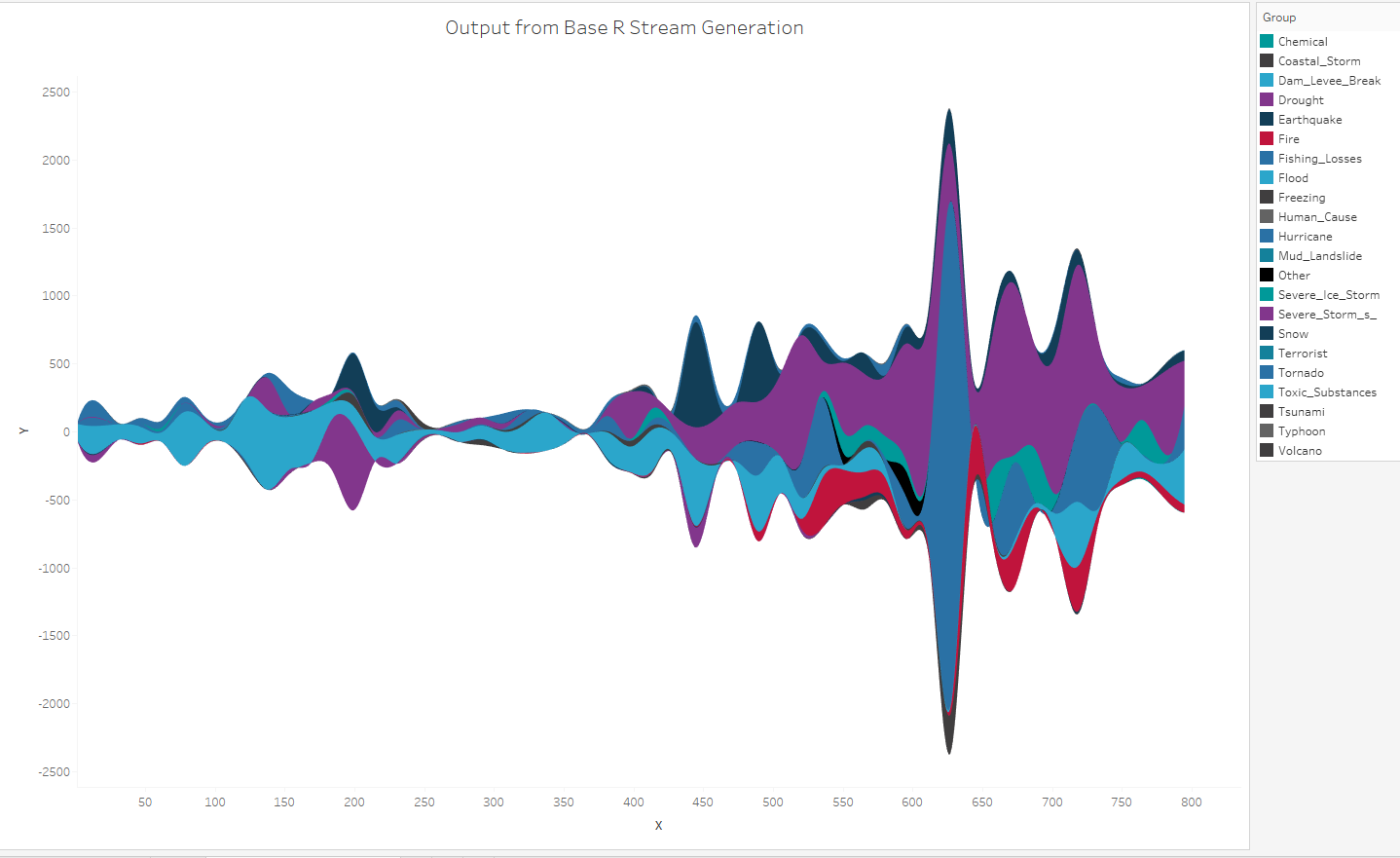
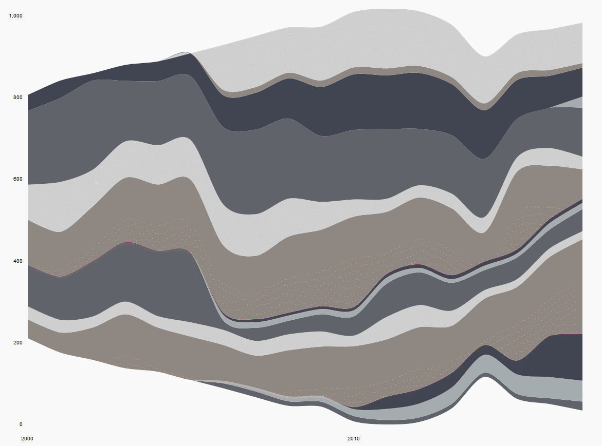
From end to end it's about 100 lines of code and importantly, does actually feature a way to output a data set which can be loaded into Tableau (as above), as well as being able to customise certain parameters of the stream graph which can affect the result. You'll notice that the axes are numbers, not years or counts, so further work should be done to make sense to humans. Within R, I found the script oddly temperamental (e.g. to generate plots in R to check the result), working for me one evening but not the next with no apparent changes made in between. Because of that, I've only generated the FEMA data for this one.
Best for: embedding something striking within a dashboard that you can add additional context and information to.
R streamgraphs
If you enable R:devtools you can access a lot of in-development content for R on GitHub and other repositories, including packages which call D3 libraries to generate complex charts. Bob Rudis has made one for stream graphs which, excepting data preparation (to get data into a tidy format), can generate one in less than five lines of code. Here's one with the FEMA data;
And here's the same with the SPLC data.
Saying it only took a short time to code (since there is no formatting in these R plots except picking different colours) makes it sound simple but there were a few rides into WTH land as I experimented with the package. These are gifs to show the level of interactivity incorporated into the package's functions (label and # at the top left). Most people are probably thinking of something closest to this when they are thinking of a stream graph, and the interactivity of it is smooth. But it is no less essentially confined to a js file and all its peripherals, which makes these fine to add into markdown documents, but not something we can easily export the data or polygons to generate something similar in Tableau.
Best for: reports within something like Rmarkdown, Jupyter notebooks or Shiny apps; D3 also supplies the custom visuals in Power BI, and can be used as an extension in Tableau.
I hope this review has given you a bit of information about the different ways you can generate stream graphs for your data visualisation - if you have any comments then please let me know.