Communicating Data: The Warming Stripes (Tie)

My current commute read is a book about how to design data communications (no pie charts, no 3D) which I'm finding quite a thoughtful read, despite the temperature ascent well beyond 35 degrees on the Piccadilly Line lately. It's particularly thoughtful during this suspiciously long hot summer with little rain in London, and it brought to mind an example I remember from June about communicating simultaneously dry and controversial data in a salient way.
This is The Warming Stripes, and more specifically, The Warming Stripes Tie/Earrings/Brooches/Cufflinks which meteorologists wore on the Summer Solstice of 2018 to draw attention to global temperature rises. It was designed by Professor Ed Hawkins, a climate scientist at the University of Reading, who also generated similar visualisations for different parts of the world, which you can read about in his blog post here.
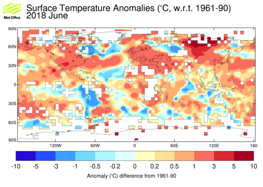
One reason why The Warming Stripes is so effective is its use of colour to indicate exactly what the change is. Each bar of colour represents either the average temperature for that year (for reasonably geographically small places, like Central England or Toronto) or changes in temperature for larger areas (e.g. global temperatures). The one which draws the eye the most is that for global temperatures, at the top of this post, while the data which Hawkins used to create the data is available from the Met Office, which adds a map showing more geographic variance in temperature change.
The story of The Warming Stripes needs little in the way of explicit direction, which is also why it is so adaptable to odd media (like ties and earrings). Secondly, very few people are climate scientists, and it makes a problem which affects everyone, but is nonetheless difficult to grasp as a risk - because hey everyone like sunbathing in Hyde Park right? - far more intelligible, because it demonstrates the actual data of the change in temperatures. Therefore, it shouldn't come as any surprise that it was picked up by meteorologists the world over on June 21st 2018, to draw attention to the problem.
This data has been used in a similar way before, first with The Spiral, which Ed Hawkins also created and took on quite a life of its own, ending up at the Opening Ceremony of the 2016 Rio Games. The Spiral's innovation and versatility inspired animated and 3D versions (see second line of this post), but also on other climate topics such as Arctic Sea Ice or Carbon Emissions, which you can see on Hawkins' insightful post here. Similarly, climate data establishes the context of XKCD's "long scroll" explanation of climate change over time, which is also well worth a look.
Harder to fit those on ties or brooches though.